Web Page Template
If you want to create a responsive website that works on all browsers and all devices, try this free web page template.
The page is powered by flexbox. And it is designed with progressive enhancement; so it works on all browsers - even older
browsers that don't support flexbox. - Download template
About the Template
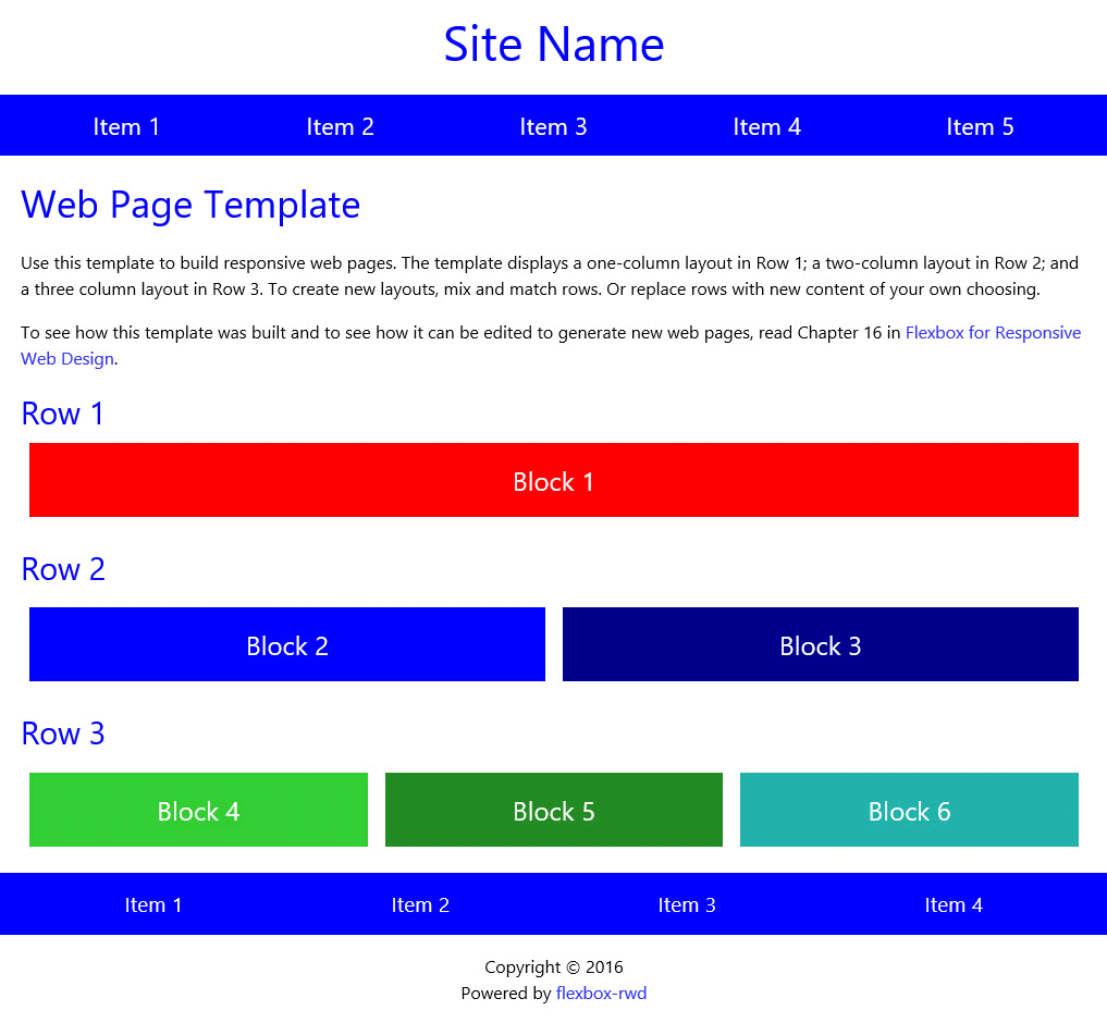
Here's what the template looks like on a large screen. I used this template to build all of the pages
on this website. If you're looking at a large screen right now, you can probably see the resemblance.
Of course, you can change the look. The template uses standard HTML
and CSS, so you can can easily customize fonts, colors, layouts, or anything else.
Most important, the template produces highly responsive web pages. Test it out. Shrink and expand your
browser window, and see how pages built from this template reconfigure to fit the viewport.
Template User Guide
The template was built using tools and techniques described in
Flexbox for Responsive Web Design.
The last chapter of the book is a user guide for this template. It describes step-by-step how the template was
built. And it shows how to edit the template to create new pages with new layouts.
How to Download the Template
Files for this web page template require about 35 KB of disk space. Follow these
instructions to download the files:
- Click the "Download" button below.
- From the the dialog box that appears, Choose "Save File". Then, click "OK".
- Files will be saved to the "Downloads" directory on your computer.
- The files will be in a zipped folder, named "flexbox-rwd-template".
- Drag the zipped folder to a new location of your choice.
- To unzip the folder, press and hold (or right-click) the folder, select "Extract All", and follow instructions.
When the folder is unzipped, you'll see four files - an HTML file, a CSS file, a javascript file, and a readme.txt file. The readme.txt
file provides "Get Started Quick" instructions for working with the template. If you don't have the book,
the readme.txt file may be helpful.
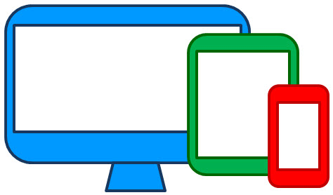
Fully Responsive
Powered by flexbox, the template reconfigures itself to fit the device on which it is displayed.
Browser Support
Designed to work on all browsers – even old browsers that do not support flexbox.
Easy to Use
Built from HTML5 and CSS – no javascript, no extra frameworks, no floats, and no clearfix hacks.