Websites That Work Everywhere
Responsive web design is all about creating flexible websites that work equally well on
phones, tablets, computers, and other devices. The key word is “flexible”.
The CSS flexible box model, known as flexbox, is a new layout tool that can help you build flexible websites
painlessly, with just a few lines of code. It is powerful, easy to learn, and easy to use.
About This Book
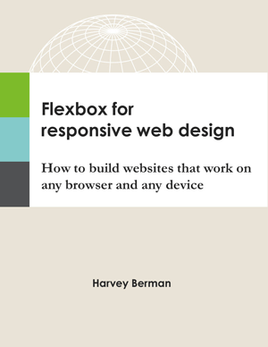
Flexbox for Responsive Web Design
is a practical guide that explains the principles, benefits, and challenges of responsive web design with flexbox.

Topics are explained in clear, easy-to-understand language. Key points are reinforced with real-world examples.
And code is provided so you can see exactly how everything works.
What You Will Learn
As you progress through the book, you will learn to:
- Position content where you want with flexbox – no floats, no workarounds, and no hacks.
- Generate responsive text that is readable on any screen – the right font size, line-height, and line length.
- Serve responsive images efficiently – the right image at the right size – using simple HTML and CSS.
- Build flexible navigation panels that work great on desktops, tablets, and mobile phones.
- Design responsive web pages - pages that adjust automatically to different devices and screen sizes.
By the end of the book, you will have a customizable template for a fully-responsive web page powered by
flexbox – a tangible product that you can use for your own projects.
In fact, I used the template from the book (see Chapter 16) to build this very website.
Frequently-Asked Questions
-
Is flexbox ready for prime time?
Yes! Flexbox is fully supported by all modern browsers. That represents 83% of browsers worldwide.
-
What about older browsers?
The book shows how to design with progressive enhancement to build websites that work for everyone,
even folks who use old browsers that don’t understand flexbox.
The bottom line is this: The challenge posed by browser support for flexbox should not be a deal-breaker.
Effective strategies exist to use flexbox and still deliver fully-functional websites to any browser.
-
Why this book?
There is nothing hard about building responsive websites with flexbox. But there are a few moving parts.
This book focuses on the most important parts, so you can quickly acquire the skills you need to design
responsive websites that work everywhere.
-
Who is this book for?
This book is for web designers who want to build responsive websites that work on any browser and any device.
The only requirement is a basic understanding of HTML and CSS – no javascript required.
-
Can I download source code?
Yes. For source code, visit this site’s Downloads page.
You can download source code for all of the examples from the book.
-
Who is writing this book?
Hi, I’m Harvey Berman. I have a bachelor’s degree in Industrial Engineering and a PhD in Psychology, both from Georgia Tech.
In 2005, I built Stat Trek, an educational website developed to help people teach themselves statistics.
In my spare time, I play golf and bridge – both poorly. - Read more
Table of Contents
Preface
Part 1. Flexbox tutorial
Introduction to flexbox
Flexbox terminology
Flexbox containers
Item flow and order
Item alignment
Item flexibility
Part 2. Browser support strategies
Vendor prefixes
Progressive enhancement
Part 3. Responsive web design
Media queries
Responsive text
Responsive images
Setting the viewport
Part 4. Responsive web pages
Responsive navigation
Responsive footer
Responsive layout
Responsive web page
Appendix A. Flex direction
Appendix B. Autoprefixer
Appendix C. Checkbox hack
Buy Now!
Is the book free? No! Of course, it’s not free.
But you can download a free sample of the book in Kindle format at Amazon.com.
If you like what you see in the sample, the whole book only costs $9.99.